【Web制作コーディング練習用】HTML、CSS、JavaScriptを使ってホームページを作る方法
YouTubeにて上記デザインのコーディングをしてみました
コーディングのポイントは以下の2点です
- 人がスクロールに追従して動き、コインと重なった時に獲得したようなアニメーションを実装
- テキストエリアの背景は文字数や画面幅が変わってもデザインのギザギザを保ったまま実装する
目次(読みたい所をクリック!!)
スクロールに追従してアニメーション
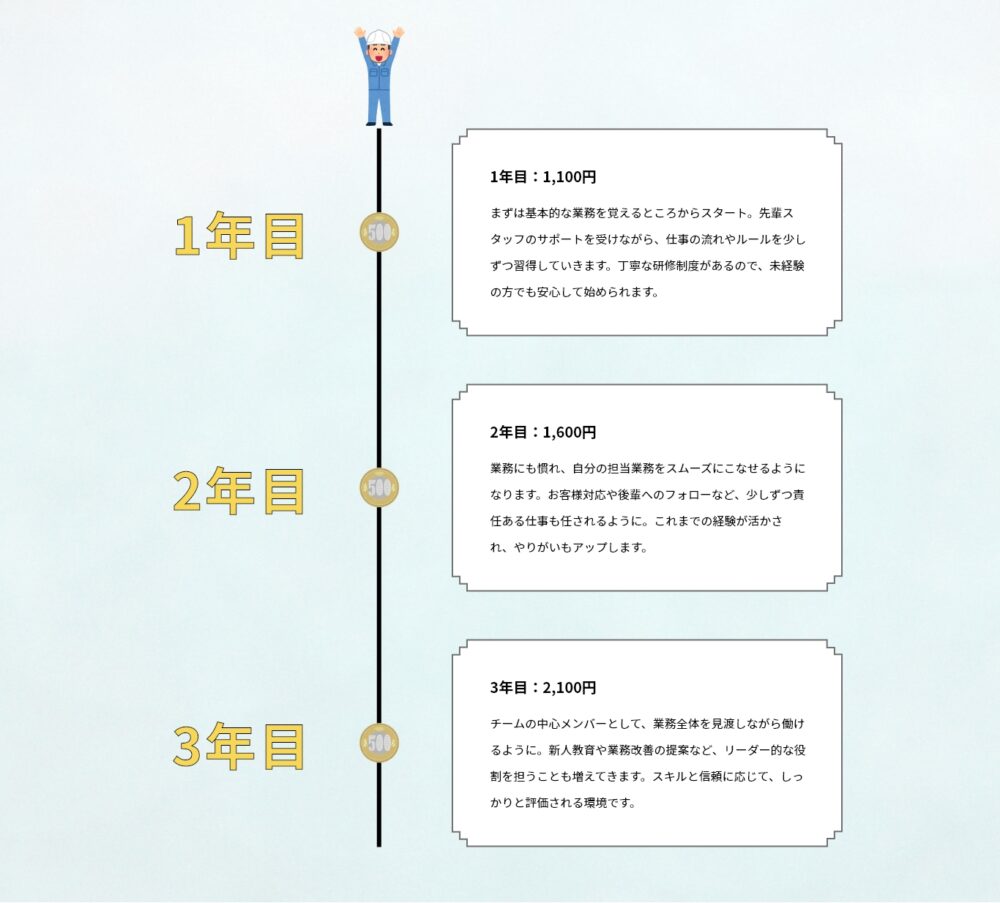
今回のデザインの1つ目のポイントはスクロールに追従するアニメーションです
スクロールに追従させたアニメーションの場合、JSを使って座標を取得する必要がありますがなんでもかんでもJSでやってしまうと、画像の読み込みタイミングやブラウザのリサイズで位置がバグってしまうことがあります
なので今回の場合は、追従はposition:sticky;を使用しています
コインとの要素の判定にのみ、JSを使用しています
背景がギザギザでもレスポンシブでいい感じに
背景のデザインが四角形じゃない場合、レスポンシブに対応するために一手間加える必要があります
今回の場合は四隅がギザギザになっているデザインです
もし背景を画像で実装してしまうと下記画像のように角のバランスが崩れてしまいます
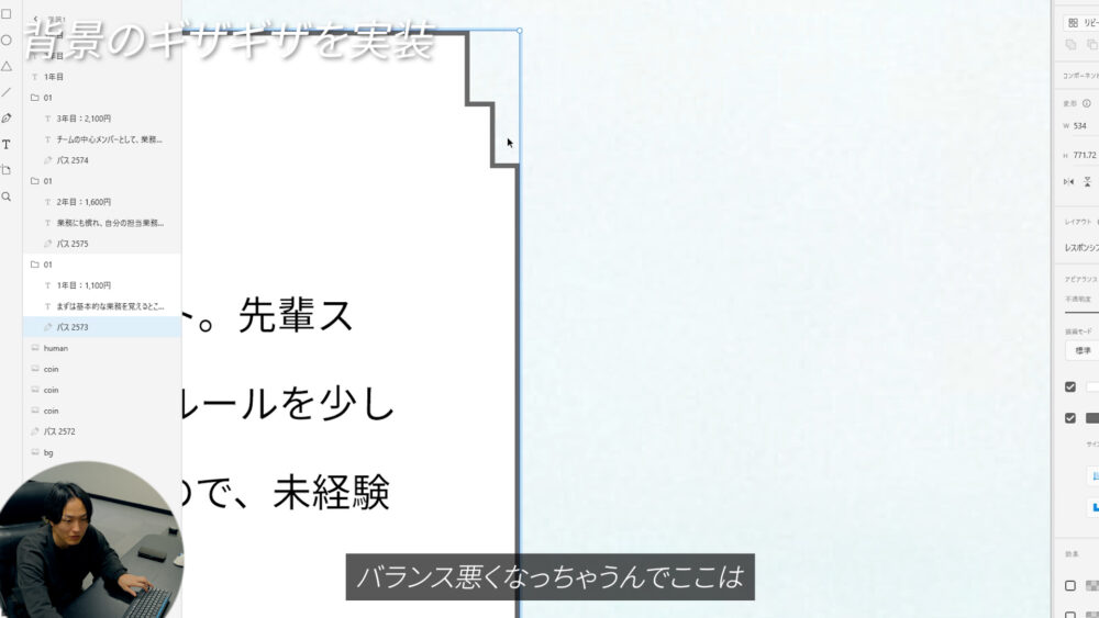
したがって今回はbackground-imageとclip-pathを使用して実装しました
background:
//左上
  linear-gradient(to right, #707070) top 20px left 0px / 12px 2px no-repeat,
  linear-gradient(to top, #707070) top 10px left 10px / 2px 12px no-repeat,
  linear-gradient(to right, #707070) top 10px left 10px / 12px 2px no-repeat,
  linear-gradient(to top, #707070) top 0px left 20px / 2px 12px no-repeat,
  //右上
  linear-gradient(to left, #707070) top 20px right 0px / 12px 2px no-repeat,
  linear-gradient(to top, #707070) top 10px right 10px / 2px 12px no-repeat,
  linear-gradient(to left, #707070) top 10px right 10px / 12px 2px no-repeat,
  linear-gradient(to top, #707070) top 0px right 20px / 2px 12px no-repeat,
  //左下
  linear-gradient(to right, #707070) bottom 20px left 0px / 12px 2px no-repeat,
  linear-gradient(to bottom, #707070) bottom 10px left 10px / 2px 12px no-repeat,
  linear-gradient(to right, #707070) bottom 10px left 10px / 12px 2px no-repeat,
  linear-gradient(to bottom, #707070) bottom 0px left 20px / 2px 12px no-repeat,
  //右下
  linear-gradient(to left, #707070) bottom 20px right 0px / 12px 2px no-repeat,
  linear-gradient(to bottom, #707070) bottom 10px right 10px / 2px 12px no-repeat,
  linear-gradient(to left, #707070) bottom 10px right 10px / 12px 2px no-repeat,
  linear-gradient(to bottom, #707070) bottom 0px right 20px / 2px 12px no-repeat,
  //右辺
  linear-gradient(to left, #707070) top 20px right 0px / 2px calc(100% - 40px) no-repeat,
  //下辺
  linear-gradient(to top, #707070) bottom 0px left 20px / calc(100% - 40px) 2px no-repeat,
  //左辺
  linear-gradient(to right, #707070) top 20px left 0px / 2px calc(100% - 40px) no-repeat,
  //上辺
  linear-gradient(to bottom, #707070) top 0px left 20px / calc(100% - 40px) 2px no-repeat white;
clip-path: polygon(
  //左上
  0px 20px,
  10px 20px,
  10px 10px,
  20px 10px,
  20px 0px,
  //右上
  calc(100% - 20px) 0px,
  calc(100% - 20px) 10px,
  calc(100% - 10px) 10px,
  calc(100% - 10px) 20px,
  calc(100% - 0px) 20px,
  //右下
  calc(100% - 0px) calc(100% - 20px),
  calc(100% - 10px) calc(100% - 20px),
  calc(100% - 10px) calc(100% - 10px),
  calc(100% - 20px) calc(100% - 10px),
  calc(100% - 20px) calc(100% - 0px),
  //左下
  20px calc(100% - 0px),
  20px calc(100% - 10px),
  10px calc(100% - 10px),
  10px calc(100% - 20px),
  0px calc(100% - 20px)
);